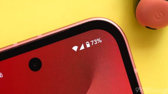
Google is set to revolutionize the Android experience with the upcoming Android 16, showcasing a fresh design language that promises to enhance user interaction. Recent leaks have revealed exciting updates, including a redesigned battery icon that reflects Google’s commitment to innovation.
- Google developing new design language for Android 16
- Redesigned battery icon features horizontal orientation
- New icon influenced by Material 3 Expressive
- Color changes indicate battery status and modes
- Significant departure from previous Android styles
As of 2025-05-05 23:45:00, Android enthusiasts are buzzing about the new “Material 3 Expressive” design language, which emphasizes a modern aesthetic. The latest leak highlights a horizontally oriented battery icon that changes colors based on the battery’s status, indicating a significant shift in Android’s visual identity.
This redesign raises questions about user adaptability and the future of mobile interfaces. How will users respond to these changes? Will this shift influence other platforms to follow suit? Consider the following implications:
- Enhanced user experience through intuitive design.
- Potential influence on competitors like Apple and Samsung.
- Increased focus on visual clarity and functionality.
As we anticipate the official release of Android 16, it’s crucial to stay informed about these developments. Will this new design language set a standard for future updates across all platforms?


![T-Mobile customers are only now finding that T-Life records their screen [UPDATED]](https://news.faharas.net/wp-content/uploads/2025/05/T-Mobile-Users-Shocked-as-T-Life-Secretly-Records-Screens-–-What-230x129.jpg)


