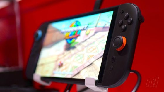
The Nintendo Switch 2 is generating buzz as its launch approaches, with fans eagerly discussing its features and pricing. However, a new topic has emerged: the console’s box art. As of May 29, 2025, the conversation has shifted from excitement to criticism over the design choices made for the Switch 2’s packaging.
- Nintendo Switch 2 box art criticized online
- Fans dislike cluttered design and red color
- Pokémon game release date announced
- Fine print aims to clarify game compatibility
- User comments highlight preference for original art
- Box art changes prioritize messaging over aesthetics
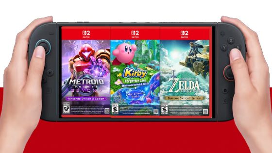
Recently, Pokémon Company International announced a new title set for release on October 16, 2025, alongside the Switch 2. While many fans were initially thrilled about the game, their enthusiasm quickly turned to disappointment regarding the box art, which they deemed unattractive due to a large disclaimer that clutters the design.
As discussions unfold, one can’t help but wonder: will this aesthetic choice impact sales? The debate continues, leading US to consider how design elements affect consumer perception.
This situation raises questions about marketing strategies in the gaming industry. How important is box art in influencing buyer decisions? The feedback suggests that aesthetics matter significantly in a competitive landscape.
- Box art plays a crucial role in consumer attraction.
- Cluttered designs may deter potential buyers.
- Branding messages can overshadow artistic elements.
- Market Trends may shift based on consumer feedback.
As we look ahead, it will be interesting to see how Nintendo adapts its marketing approach to address these concerns and enhance the overall consumer experience.


![T-Mobile customers are only now finding that T-Life records their screen [UPDATED]](https://news.faharas.net/wp-content/uploads/2025/05/T-Mobile-Users-Shocked-as-T-Life-Secretly-Records-Screens-–-What-230x129.jpg)


