In the ever-evolving landscape of global technology News, Apple has made headlines by revising its design choices for the upcoming operating systems. Following the recent WWDC 2025 event, the tech giant has already walked back some visual elements, particularly in its new Liquid Glass operating system. This shift highlights the challenges Apple faces in balancing innovation with user preferences.
- Apple revises design elements post-WWDC 2025.
- Liquid Glass interface faces mixed reactions.
- Control Center background adjustments implemented.
- Finder app icon redesign sparked controversy.
- Traditional color scheme restored in latest beta.
As of June 24, 2025, the latest developer betas reveal that Apple has adjusted the appearance of the Control Center and the Finder app icon. While some users appreciated the layered transparency in the Liquid Glass interface, others found it overly complex and difficult to read. The changes to the Control Center now feature a darker background, enhancing visibility during use.
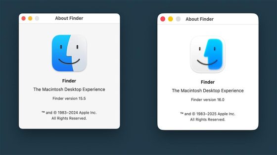
Another contentious update involves the Finder app icon in macOS Tahoe, which initially flipped the traditional color scheme. This alteration sparked significant backlash from users, leading Apple to revert to the familiar design in the latest beta. How will these adjustments impact user experience and brand loyalty?
As Apple navigates these changes, one key question arises: how will user feedback shape future updates? The tech community is watching closely, as these decisions can influence broader industry standards.
- Apple’s responsiveness to user feedback may enhance customer loyalty.
- Design changes could set new trends in user interface for other tech companies.
- Balancing innovation with usability remains a critical challenge for tech giants.
As we look ahead, it will be fascinating to see how Apple continues to adapt its designs in response to user needs. Will they strike the perfect balance between innovation and familiarity?