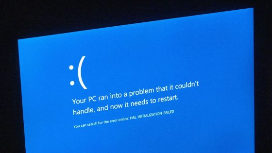
Microsoft’s recent decision to replace the iconic Blue Screen of Death (BSOD) with a black crash screen marks a significant shift in Windows operating systems. This change, announced on June 27, 2025, aims to enhance clarity and align with modern design principles.
- Windows 10 introduced QR code for support.
- Windows 11 briefly changed BSOD color to black.
- 2024 incident prompted design change for crash screen.
- New design aims for clarity and simplicity.
- Blue associated with calmness; black feels ominous.
- BSOD acronym will likely persist despite changes.
The transition comes amid ongoing concerns about system reliability, especially following a 2024 incident where a faulty update disrupted numerous industries. As Microsoft seeks to distance itself from the negative connotations of the BSOD, the new design aims to streamline user experience while retaining essential technical information.
This redesign raises questions about user recognition and the psychological impact of color in technology. Will users easily identify a black crash screen as a critical error? Consider these points:
- The black screen may blend in with other system notifications.
- Blue is often associated with calmness and reliability, whereas black can evoke negativity.
- This change could affect how users perceive Windows’ stability.
As Microsoft moves forward, it will be essential to monitor user feedback and adapt accordingly. Will this change improve user confidence, or will it lead to further confusion? Only time will tell.