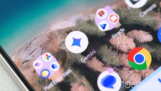
Google’s Gemini app is undergoing a significant branding transformation, aligning its icon with the company’s primary color scheme. This change reflects Google’s confidence in its AI capabilities, marking a new chapter for the Gemini platform.
- Gemini adopts a new color palette.
- Logo updated for Android and iOS.
- Red variant phased out for clarity.
- New icon features four colors and gradient.
- Branding aligns with other Google apps.
- Concerns about uniformity in app icons.
Since its launch, Gemini has featured a unique blue-purple palette, but as of June 30, 2025, the app is set to adopt a more familiar look. The new icon incorporates a vibrant four-color design, harmonizing with Google’s recent logo updates.
This branding shift raises an important question: will this change improve user engagement with the Gemini app? The transition aims to create a cohesive visual identity, but does it risk losing the distinctiveness that set Gemini apart?
- Enhanced brand recognition may lead to increased user adoption worldwide.
- Uniformity in app design could streamline user experience across Google services.
- Potential confusion may arise as users may struggle to differentiate between similar icons.
As Google continues to evolve its AI offerings, users should stay tuned for further updates that could redefine how we interact with technology in our daily lives.


