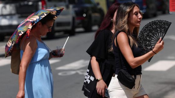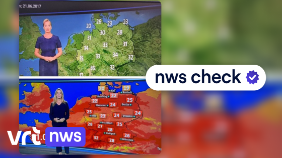
Recent social media posts claim that weather maps in Belgium have been altered to appear “extra red,” supposedly to stir fear about climate change. This topic has sparked debate among viewers who question the accuracy of these visuals. On 2025-07-02 12:40:00, fact-checkers examined these claims to clarify the situation.
- Social media spreads misleading weather map collages
- Collages falsely suggest extra red coloring
- Factchecks reveal mixed map types compared
- VRT weather maps use official color palette
- Maps scaled with data providers' consultation
- KMI collaborates on weather map scaling
Many of these viral collages compare different types of weather maps or images from various broadcasters and years, which can mislead the public. But how reliable are the current weather maps used by Belgian News outlets, and do they really exaggerate climate change risks?
Understanding the truth behind these weather maps is essential to avoid misinformation and maintain trust in local meteorological reporting. Let’s explore what fact-checkers have uncovered.
Why do these misleading weather map claims persist? Are weather visuals really designed to provoke fear? Here’s what you need to know:
- Comparisons often mix different map types, broadcasters, or years, creating false impressions.
- VRT NWS maps use the official VRT colour palette, carefully calibrated with meteorological data from the Royal Meteorological Institute (KMI).
- Colour intensity reflects real temperature and weather data, not an attempt to sensationalize climate change.
- Fact-checks confirm that these maps aim to inform, not to manipulate public perception.
As climate discussions continue to evolve, staying informed about how weather data is presented will be crucial. Always question sensational claims and rely on verified sources to understand what the maps truly show.